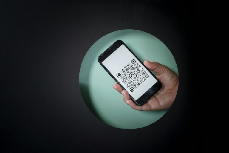
Every advent calendar brief we get now includes some version of the same request: “we want a QR code behind each door.” The idea is sound — a countdown structure with 24 or 25 individual openings is, structurally, already built for repeated digital touchpoints, and the connected packaging category has moved well past novelty. According to the 2026 Global Connected Packaging Survey from Appetite Creative, 92.3% of industry professionals now consider connected packaging increasingly critical to their business, and nearly half of brands (47.1%) are already running QR and NFC side by side on the same packaging line — QR for mass-reach formats, NFC for the premium tiers where a tap feels more deliberate than a scan.
What’s harder than the idea is the execution. A QR code that works perfectly on a white product label often becomes unscannable the moment it’s foil-stamped onto a dark, textured, luxury rigid box. This is the part of the brief that gets skipped in most conversations about “smart packaging,” and it’s the part that determines whether the feature actually works on launch day or quietly fails behind door 14 while nobody notices until customer service starts getting emails.
Why luxury finishes are exactly what breaks QR codes
QR codes rely on contrast. A scanner reads the pattern by distinguishing dark modules from light background — which is precisely the opposite of what most luxury packaging design wants to do. Foil stamping, embossing, spot UV, and deep matte finishes are all chosen because they reduce flat contrast in favor of texture and depth. That’s a problem for a QR code specifically, because:
- Metallic foil backgrounds reflect light unevenly, which confuses a phone camera’s auto-exposure and can make a technically valid code unreadable under certain lighting.
- Embossed or debossed codes rely on shadow for contrast rather than ink, which works inconsistently depending on the angle and light source — fine for a logo, unreliable for a code that needs to scan on the first try.
- Dark-on-dark color palettes, common in premium gifting (deep green, black, burgundy), often push the actual print contrast below what scanning algorithms need, even when the design “reads” as high-contrast to the human eye.
None of this means luxury packaging and QR codes are incompatible — it means the code has to be treated as a functional element with its own design rules, not dropped into the layout at the end. In practice, that usually means a dedicated, flat-printed panel for the code itself — even a small one — set against a genuinely light, uncoated or matte (not gloss, which creates glare) background, sized no smaller than roughly 2 x 2 cm for a code meant to be scanned at arm’s length. It’s a small compromise in an otherwise fully premium design, and it’s the difference between a feature that works and one that generates support tickets.
Where to put it on a 24-door advent structure
For a full advent calendar, placement is its own design problem, separate from the print quality issue. There are three common approaches, each with a different trade-off:
One code per door, hidden behind each numbered opening, tied to that day’s specific content — a video, a how-to, a playlist, a small AR moment. This is the most immersive option and the one that gets the most social sharing, but it multiplies the production and content workload by 24 or 25, and it means each code needs individual placement quality control, not just one design check.
A single code on the outer packaging, linking to a rotating or date-gated digital experience that changes automatically each day. This is significantly simpler to produce and quality-control, and it allows content to be finalized or adjusted later in the production timeline, since the code itself doesn’t need to change — only what it points to. The trade-off is a slightly less “discovery” feeling, since the code isn’t a surprise behind each door.
A code inside the final door or on the base of the structure, positioned as a single closing moment — a thank-you video, a loyalty offer, or an invitation to next year’s release — rather than a daily touchpoint. This is the lowest-complexity option and works well for brands testing connected packaging for the first time without committing to a full daily content calendar.
For a first smart advent calendar, the single-code, date-gated approach is usually the more realistic starting point. It proves out the concept without requiring 24 separate pieces of finished content ready before the print run locks.
QR or NFC — and why the answer depends on the price tier
QR codes remain the more universal choice: no compatible hardware required beyond a phone camera, no manufacturing cost added to the box, and no risk of a chip failing during a drop or during transit. For most gifting and confectionery advent calendars, QR is the practical default.
NFC (the same near-field chip technology used in contactless payments) changes the interaction from “scan” to “tap,” which reads as a more deliberate, premium gesture — the kind of detail that shows up in high-end spirits and fragrance packaging specifically because the tap itself becomes part of the unboxing ritual, not just a means to an end. Johnnie Walker Blue Label’s use of an NFC chip in the bottle closure is a well-known example: a tap verifies authenticity and unlocks tasting notes and provenance information, without requiring any visible code to be printed on the packaging at all — which also sidesteps the entire contrast and placement problem QR codes create on dark, textured finishes.
The trade-off is cost and fragility: NFC tags add a per-unit component cost that scales with volume in a way flat printing doesn’t, and a chip embedded in a fragile fold or hinge point can fail under repeated handling in a way a printed code simply can’t. For a 24-door structure specifically, NFC tends to make more sense concentrated in one or two key moments (the outer box, the final door) rather than embedded in every single opening, both for cost reasons and because a chip failure inside door 9 is much harder to catch in quality control than a print defect.
What to actually put behind the code
The technical execution matters, but it only matters if there’s something worth scanning for. The content side of a smart advent calendar tends to fall into a few categories that consistently perform:
- Day-specific tutorials or usage guidance — particularly effective for cosmetics and skincare advent calendars, where a short video on how to use that day’s product addresses a real customer need rather than existing purely for engagement.
- Authentication and provenance — sourcing story, ingredient origin, or a certificate of authenticity, which matters disproportionately in the luxury segment where counterfeit concern is real.
- A reorder or restock link tied to the specific product behind that door — arguably the most commercially direct use of the feature, since it puts a purchase path directly at the moment of product discovery.
- A cumulative reveal or loyalty mechanic, where scanning contributes toward an end-of-calendar reward, which is the version most likely to drive daily engagement rather than a single scan-and-forget interaction.
One practical note worth building into the plan from the start: use dynamic QR codes (where the destination URL can be updated after printing) rather than static ones. Print production timelines for a 24-door luxury structure often run months ahead of the final content being locked, and a dynamic code means content can be finalized, adjusted, or corrected without needing a reprint.
Building it into the production plan, not bolting it on afterward
The single biggest cause of a smart packaging feature underperforming isn’t the technology — it’s sequencing. QR or NFC integration works best when it’s part of the structural and print brief from the beginning: which panel gets the flat print zone, what finish sits immediately around it, whether a door’s hinge or fold interferes with a chip’s read range, and how many individual placements need their own quality check before the print run is approved. Retrofitting a code onto a finished design after the foil stamping and embossing decisions are already locked is exactly how you end up with a beautiful box and an unscannable code.
If you’re planning a smart advent calendar or another connected luxury gift structure for this year’s holiday season, the print and structural decisions need to happen alongside the digital content plan, not after it — and that’s exactly the kind of conversation worth having at the brief stage.
Ready to plan the structure, materials, and print zones for your next connected packaging project?