When it comes to packaging and printing, consistent and accurate colour is essential. A brand’s identity often depends on its specific shades, from the deep red of a luxury chocolate box to the vibrant blue of a corporate gift package. This is where the Pantone Colour Matching System (PMS) comes in — a universal standard that ensures colours are reproduced accurately across materials, printers, and countries.
At DST Pack, we work closely with brands to ensure their packaging colours are consistent, eye-catching, and true to their identity. Understanding the Pantone system is key to achieving this.
What is the Pantone Colour Matching System?
The Pantone Colour Matching System is a standardized colour reproduction system widely used in printing, packaging, textiles, and product design. Developed by Pantone Inc., it assigns a unique number to each colour, ensuring that designers and manufacturers can communicate colour precisely, no matter where they are in the world.
Unlike RGB or CMYK, which are based on light or four-colour printing processes, Pantone provides pre-mixed, spot-colour inks. This means that the colour you see in your design software can be reliably reproduced in print, packaging, or product materials.
How Pantone Works
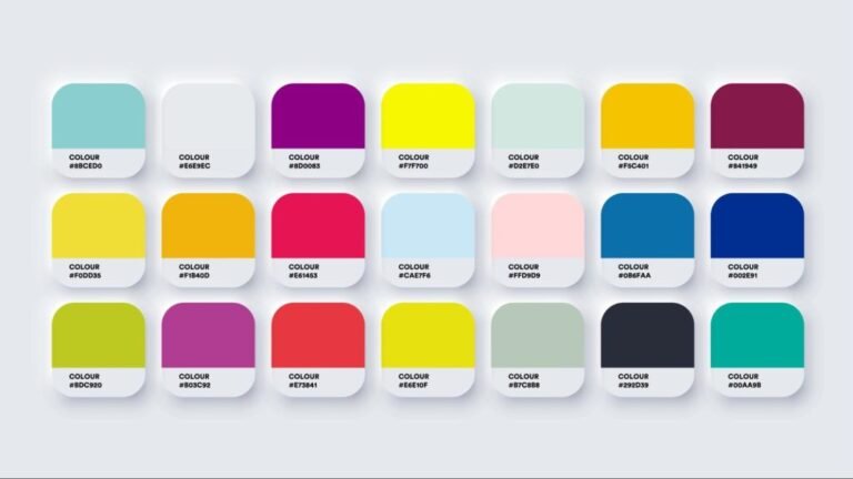
The Pantone system is based on swatch books, which are physical guides containing thousands of colours, each identified by a unique number. For example, a bright yellow might be Pantone 123 C, while a muted blue could be Pantone 7462 U. The letters “C” and “U” indicate the finish or surface type — “C” for coated paper, “U” for uncoated.
When designing packaging:
- The designer selects the desired Pantone colour from the guide.
- The printer or manufacturer mixes the exact ink formula according to Pantone standards.
- The final printed material matches the intended colour precisely, regardless of printer or location.
This process eliminates guesswork and ensures brand colour consistency, which is particularly important for logos and premium packaging.
Why Pantone is Critical for Packaging
Luxury packaging, promotional boxes, and branded materials rely on colour to convey quality and brand recognition. Inconsistent colours can damage brand perception and reduce the impact of marketing campaigns. Using the Pantone system provides several advantages:
- Consistency Across Materials: Whether printing on cardboard, paper, or plastic, Pantone ensures the colour remains uniform.
- Brand Recognition: Exact colour reproduction helps maintain a strong and recognizable brand identity.
- Global Standardization: When working with manufacturers or printing houses worldwide, Pantone numbers allow everyone to work from the same colour reference.
- Flexibility Across Processes: Spot colours can achieve vibrant hues that CMYK alone cannot, making them ideal for luxury packaging.
For example, a brand producing limited-edition gift boxes in Dubai, Abu Dhabi, or Riyadh can use Pantone spot colours to ensure the box matches the brand’s official palette, no matter which manufacturer produces it.
Pantone in Luxury Packaging
In luxury packaging, the right colour does more than look attractive — it communicates quality, style, and brand values. Pantone colours are often combined with premium finishes like foil stamping, embossing, and soft-touch lamination to create a rich tactile and visual experience.
Spot colours are especially useful for:
- Logo applications
- Metallic finishes
- Brand-specific colour accents
- Special-edition packaging
By using Pantone colours, luxury packaging can maintain the same visual identity across multiple product lines or seasonal releases.
Spot Colours vs CMYK
Pantone spot colours differ from CMYK, the standard four-colour printing process. CMYK mixes cyan, magenta, yellow, and black to create a wide range of colours, but it cannot reproduce all shades perfectly. Spot colours, on the other hand, are pre-mixed and exact.
Advantages of Pantone over CMYK:
- Exact reproduction of brand colours
- More vibrant and opaque finishes
- Better results on specialty materials like coated or textured paper
However, CMYK is still useful for full-colour images or designs requiring gradients. Many packaging projects combine CMYK printing for photographic elements and Pantone spot colours for logos or brand accents.
How DST Pack Uses Pantone
At DST Pack, we work with brands to implement their Pantone colours accurately in packaging production. We guide clients in selecting the right Pantone shades, testing samples, and ensuring colours stay consistent across all materials and production batches.
From rigid gift boxes to luxury paper bags and inserts, Pantone colour matching ensures that every package looks exactly as intended — no surprises, no compromises.