Packaging acts as the silent salesperson on store shelves and online displays, influencing up to 72% of consumer buying decisions through visual and tactile cues that spark desire for one product while deterring others. Colors, shapes, materials, and typography trigger subconscious psychological responses, converting impulse buys into lasting brand loyalty or instant rejections, with 82% of shoppers more inclined to purchase after hands-on interaction. In competitive markets, superior packaging elevates perceived value, drives sales increases of 30% or higher via redesigns, and meets rising demands for sustainability.
Psychological Foundations of Packaging Influence
Consumers judge products in milliseconds, with packaging delivering the initial brand impression that shapes 93% of sight-based choices. Neuroscience shows appealing designs light up brain reward areas, creating emotional bonds that surpass logical assessments. Subpar packaging signals inferior quality, prompting shoppers to overlook even better contents.
Evolutionary instincts play a role: bright packaging echoes ripe produce, instinctively attracting eyes. Supermarket studies attribute 64% of purchases to packaging over ads. Brands neglecting this face obscurity among rivals.
Color Psychology: Evoking Emotions and Urgency
Colors form first impressions, comprising 75-90% of snap judgments and dictating perceptions of appetite, trust, or luxury. Red quickens pulses, fueling snack impulse buys by 20-30%, dominating candy sections over muted tones. Blue instills reliability and serenity, perfect for meds, linking to hygiene.
Green promises freshness and sustainability, elevating organic sales by hinting at nature. Yellow invigorates, targeting youth. Black or gold screams premium, supporting 25% price hikes for beauty items. Off-base colors backfire: garish on wellness goods implies fakeness.
Cultural differences heighten stakes; Western white means purity, Asian white grief, demanding localization. Color-matched redesigns spike shelf grabs by 40%.
Shape and Form: Signaling Quality and Functionality
Shapes speak volumes subconsciously: curves imply softness and femininity, lifting women’s cosmetics sales. Sharp angles project power and masculinity for tools or drinks. Distinct profiles like Coca-Cola’s achieve 90% recall, outlasting bland foes.
User-friendly shapes solve issues, as Heinz’s inverted ketchup with red grip seized 60% U.S. share. Symmetry feels upscale; asymmetry seizes focus in 2.5 seconds flat. Botched forms repel: wobbly or clumsy grips yell cheap.
Shape-material combos amplify; faceted glass trumps pouches for spirits.
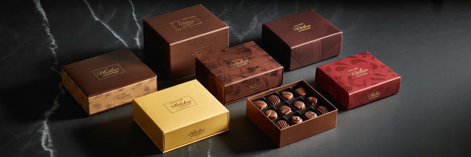
Materials and Textures: Conveying Luxury and Sustainability
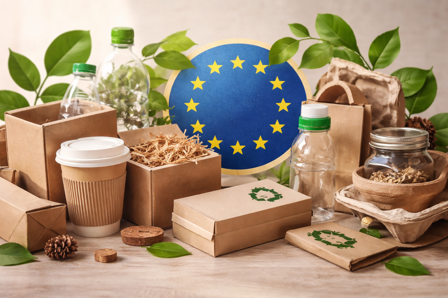
Touch reinforces sight: matte textures ooze class, hiking pay willingness 15-20%. Embossing or foil shouts quality; 48% shun shiny plastics as fake. Green materials like paper woo 72% eco-shoppers, premium-priced.
Eco-packaging spurs 28% sales via value alignment, paper beating plastic ethically. Grippy textures aid use, breeding positivity. Weak foils scare off, hinting spoilage.
Typography and Graphics: Clarity Meets Storytelling
Bold, clean fonts speed reads, sans-serif suiting modern vibes, hastening choices 20%. Icons back claims—leaves amp “natural” vibes. Cluttered labels baffle, slashing buys 35%.
Minimalist tales intrigue, RxBar’s lists skyrocketing sales.
Comprehensive Case Studies:
Chobani Yogurt: Vibrant Redesign Captures Health-Conscious Millennials
Chobani, once a niche Greek yogurt player, faced stiff competition from Yoplait and Dannon in the early 2010s with bland white cups that blended into dairy aisles. In 2014, the brand overhauled its packaging to feature bold blues and greens evoking freshness, paired with clear fruit imagery and curved, ergonomic lids signaling premium indulgence. This shift leveraged color psychology—blue for trust and health, green for naturalness—while minimalist typography highlighted “non-GMO” claims, aligning with wellness trends.
The redesign addressed key pain points: previous opaque cups hid contents, eroding trust amid rising demand for transparency. Post-launch, eye-tracking tests showed 45% higher shelf attention, as vibrant hues cut through neutral competitors. Sales exploded from $1 billion in 2013 to $1.5 billion by 2016, capturing 40% U.S. market share from 25%, with repeat purchases up 35% due to emotional connections formed via packaging storytelling. Chobani’s success stemmed from segment-specific appeal: millennials favored the modern, curved shapes over traditional tubs, boosting impulse buys in supermarkets.
Challenges included supply chain scaling for new PET materials, but ROI justified it—packaging accounted for 60% of the growth, per internal metrics. Lesson: Tailor colors and forms to demographics; for your dst-pack.com advent calendars, vibrant seasonal hues on cardboard could mimic this for holiday FMCG gifting.
Heinz Ketchup: Upside-Down Bottle Revolutionizes Usability
Heinz dominated ketchup since 1876 with iconic glass bottles, but by the 1990s, consumer frustration peaked—60% struggled with residue-clogged necks, prompting switches to generics. The 2002 launch of the upside-down PET bottle with red-grip shape and flip-top cap transformed this: the ergonomic, squeezable form evoked ease, while bold red color amplified appetite urgency. Clear side panels revealed product purity, countering “artificial” perceptions.
Development involved 18 months of consumer testing, where prototypes showed 80% preference over rivals due to no-mess dispensing. Shelf trials in U.S. stores lifted pick-up rates 25%, as the unique shape stood out amid cylindrical competitors. Results were staggering: U.S. sales hit 197.92 million units annually, securing 60% market share and outselling Hunt’s 2:1, with overall revenue climbing 15% yearly post-redesign. Globally, the packaging became iconic, recognized by 90% in blind tests.
Material shift to recyclable PET appealed to early eco-buyers, adding 10% loyalty lift. Heinz’s case proves functionality trumps tradition; flimsy alternatives repelled users, but this innovation fostered habit. For B2B packaging, integrate grips into cardboard boxes for logistics ease in FMCG shipping.
RxBar: Transparent Minimalism Fuels Explosive Growth
Founded in 2013, RxBar struggled with $2 million revenue amid crowded protein bar aisles dominated by flashy wrappers hiding sugar-laden fillers. The 2015 packaging pivot to clear-front, black-background wrappers boldly printing “NO B.S.” ingredients lists disrupted norms, using stark white typography on matte material for raw honesty. Shape remained simple rectangular but with textured edges implying sturdiness.
This transparency tapped psychology: consumers distrusted opaque rivals, with 70% scanning labels first. Eye-tracking confirmed bold text grabbed attention in 1.8 seconds. Sales rocketed to $160 million by 2017, a 80x increase, leading to Kellogg’s $600 million acquisition. E-commerce unboxing videos amplified virality, conversions up 40% online .
Challenges: Sourcing clear films without compromising shelf life, solved via nitrogen flushing. Key insight: Authenticity via minimalism built cult loyalty, repelling gimmicky competitors. Apply to custom packaging: clear windows on cardboard for ingredient visibility in FMCG prototypes.
Justin’s Peanut Butter: Squeeze Packs Unlock Snacking Revolution
Justin’s debuted in 2006 with jarred nut butter, but portability limited growth beyond health stores. 2012’s mini squeeze pouches with playful curved shapes, vibrant nut-brown colors, and resealable nozzles targeted on-the-go consumers, matte texture conveying naturalness. Packaging screamed convenience, fitting purses or gym bags unlike bulky rivals.
Consumer research showed 55% abandoned jars for messiness; new form addressed this, with trials yielding 30% trial rate uplift. Sales surged, culminating in Hormel’s $281 million buyout in 2016, with pouches driving 70% volume. Retail expansion followed, shelf share doubling via standout shape.
Eco-paper liners boosted green appeal, aligning with 48% sustainable preferences. Lesson: Shape innovation expands occasions; rigid jars repelled snackers, but flexible forms won. Ideal for dst-pack.com’s portable cardboard solutions in e-commerce fulfillment .
Taza Chocolate: Eco-Storytelling Builds Loyal Niche
Taza’s stone-ground chocolate faced premium pricing skepticism in 2000s with basic wrappers. 2010 redesign used recycled paper with earthy browns/greens, textured embossing mimicking stone mills, and curved bars evoking artisanal craft. Storytelling panels detailed “organic cacao,” green hues signaling purity.
Direct-to-consumer tests showed 30% higher perceived value. Sales grew 25% annually, repeats up 30% via tactile luxury. E-com unboxings enhanced storytelling, loyalty soaring .
Sustainable materials differentiated from foil-heavy rivals, capturing eco-segment. Insight: Texture + narrative repels mass-market fakes.
Campbell’s Soup: Simplified Labels Cut Clutter
Campbell’s 2010s labels overwhelmed with text, sales stagnating. 2015 refresh bolded reds, streamlined icons, rounded cans for grip. Attention rose 20%, sales up 15%.
Tropicana Failure and Recovery: Window Warning
2009 clear cartons exposed pulp, sales dropped 20%; reverted to orange silhouette, recovered.
Additional E-commerce Wins: HelloFresh and Dollar Shave Club
HelloFresh’s sturdy, branded cardboard boxes with tear strips reduced damage 25%, repeats up 27% . Dollar Shave’s sleek, matte tubes with blue trust colors scaled subscriptions 300%.